AmazonVision · execution
Building Amazon's interviewer experience
Turning scattered, recruiter-era tools into one consistent experience for interviewers, plus a suite of AI tools that support them at every step of the hiring workflow.
Overview
At Amazon, hiring decisions are made by the people who run the interviews: interviewers, hiring managers, and Bar Raisers (Amazon’s trained interview leads). They prepare for interviews, take notes, write feedback, and meet to decide together. For years, they did all of it in a page built for recruiters, one that was unstable, hard to use, and impossible to build on.
As the lead and only designer, I owned this end to end:
- A dedicated workspace for interviewers.
- Merging internal and external evaluation into one experience.
- The AI tools layered across the workflow.
These are three separate bodies of work with their own research and timelines, but the way I worked across them was the same.
How I worked
- 01Owned the ambiguityTook a vague, long-lived problem space and set the direction for where it should go.
- 02Partnered widelyRan research and design workshops with PM, science, and engineers across multiple teams to ground every decision.
- 03Shipped in phasesBroke big changes into sequenced steps teams could build and launch without a risky rewrite.
- 04Knew when to stopValidated with usability testing, and recommended against the ideas that didn’t serve users.
The Interviewer Workspace
The problem
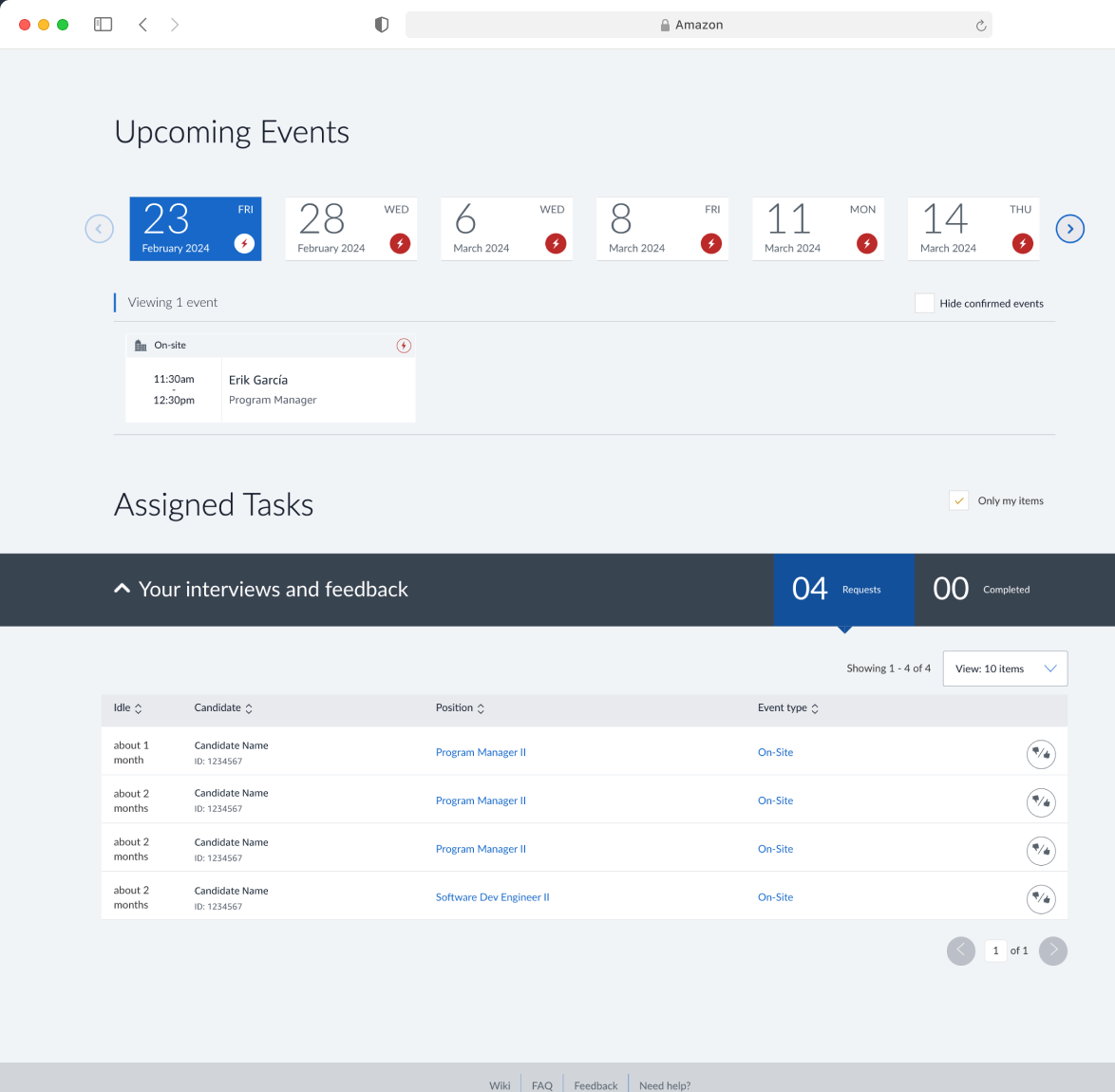
Everyone shared one page built for recruiters, and it barely helped the people interviewing. The daily friction added up:
- You couldn’t see upcoming interviews without clicking through day by day.
- Nothing tracked whether you’d accepted an invite.
- Basic details, like the competencies you were assigned, were buried or missing.
- So people ran their interview load out of Outlook and spreadsheets instead.
On top of that, the page was unstable and impossible to build on, so it couldn’t get better where it stood.
The solution
I designed the interviewers’ first real home, in two phases.
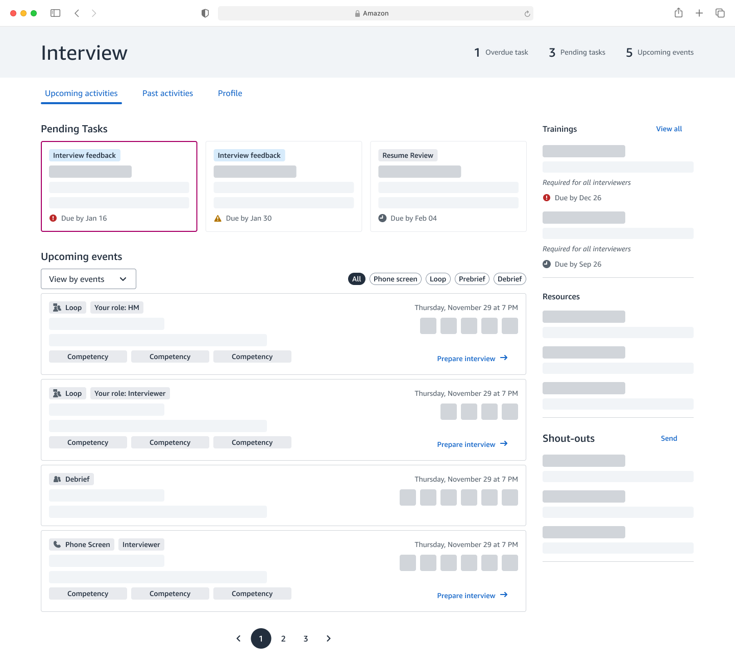
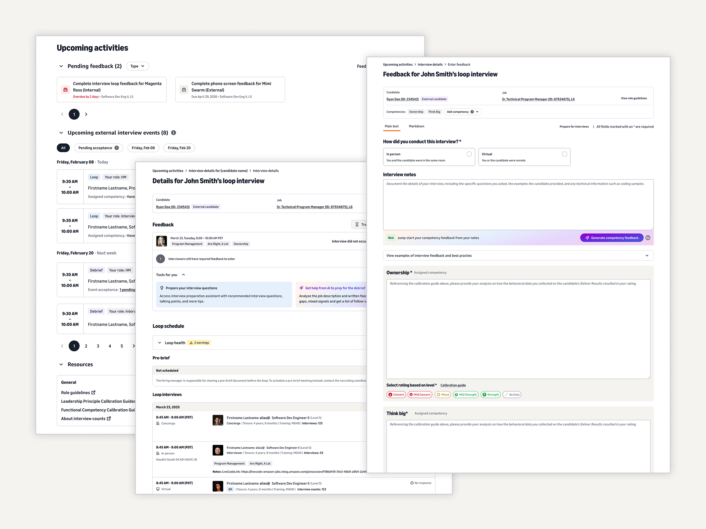
Phase 1, the Activity Page. One view for everything you act on: upcoming interviews, pending invites, outstanding feedback with overdue tracking, assigned competencies, and the resources you need. I scoped it as a foundation to build on, not an everything-at-once launch. This launched first and became the workspace’s home.
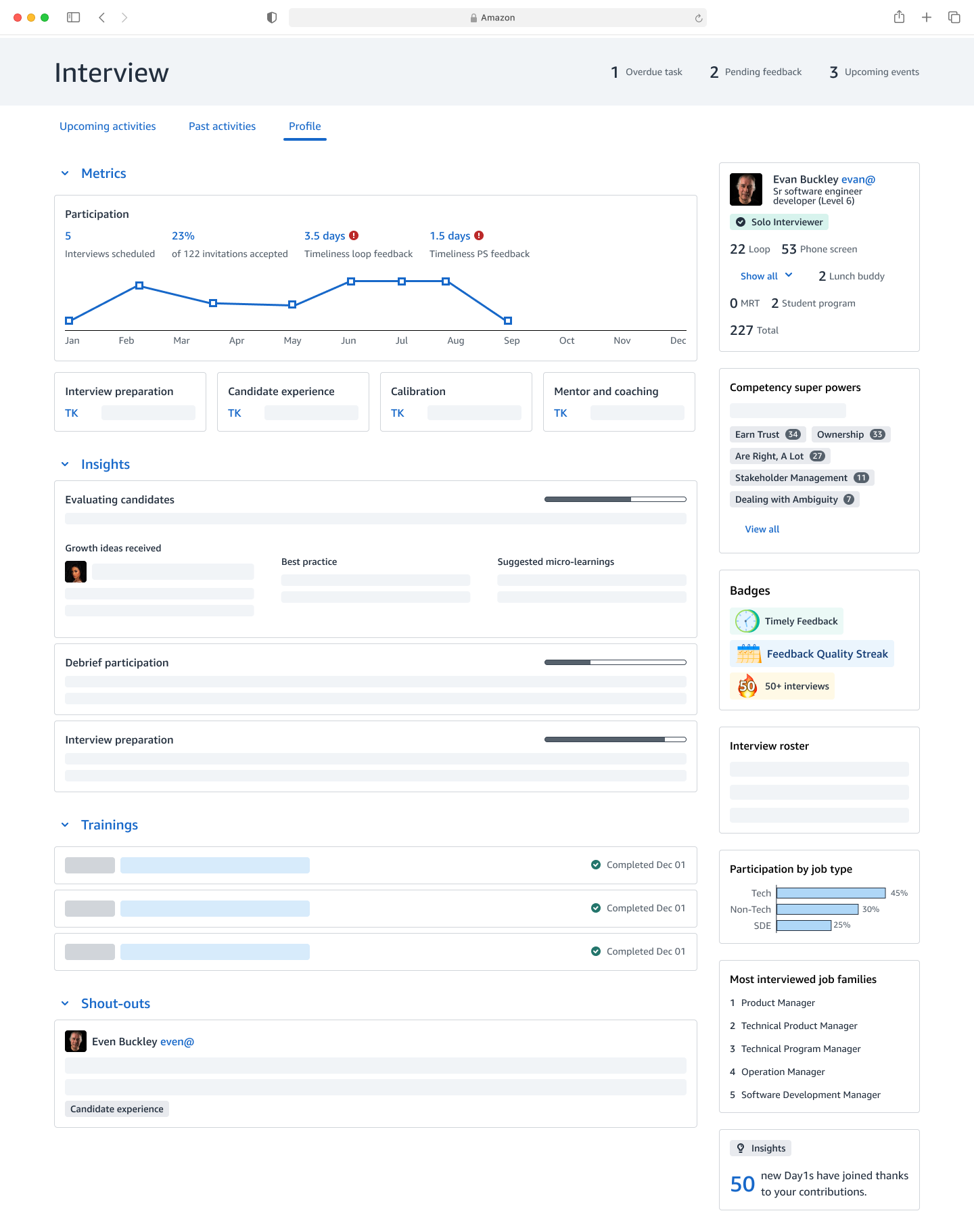
Phase 2, the Profile Page. A view of an interviewer’s experience, qualifications, and contribution, designed to be the source of truth for who’s qualified to interview and to feed scheduling and loop construction. It’s designed and in build, rolling out in phases.
A key decision: build around what interviewers need
The old page surfaced data that mattered to recruiters. The key decision was to flip that: organize the page around what each person needs to do their part of the loop.
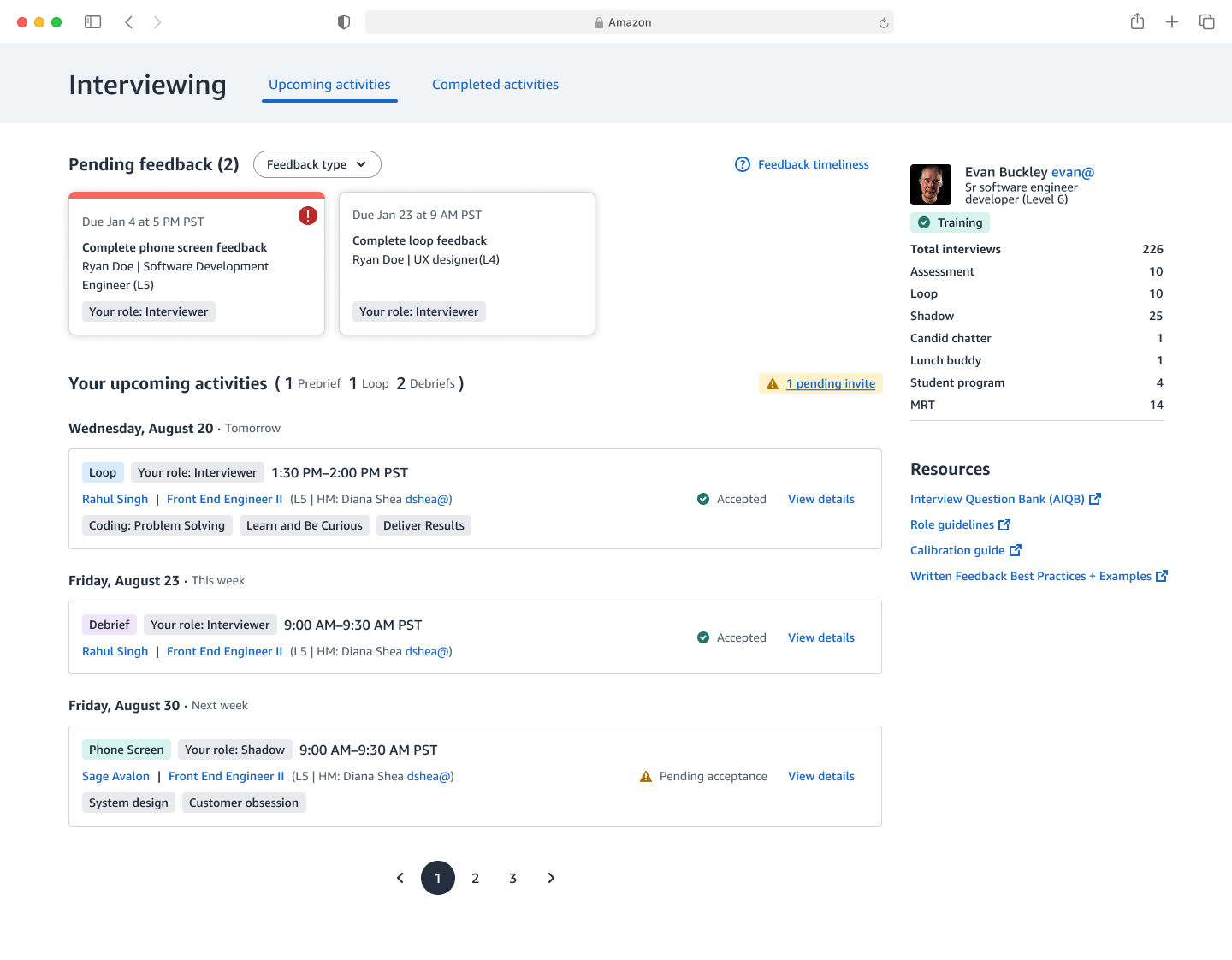
- Interviewers see their upcoming interviews, their role, what they’re assigned to assess, the candidate and job, and their acceptance status.
- Hiring managers and Bar Raisers can track acceptance and feedback- submission status across the whole loop, so they can see at a glance whether things are on track.
The outcome
The Activity Page replaced the old page and became the hiring tool’s most-trafficked page, with 1.12M page views, 80% satisfaction, and roughly the 85th percentile on the System Usability Scale in testing. Putting everything in one view did make it dense, which I expected going in, so I kept refining the layout afterward to make it easier to scan.
I love it. I can see everything on one screen. This saves me time from toggling back and forth. Interviewer, post-launch survey
Consolidating internal and external hiring
The problem
Internal and external hiring lived in two separate products, which created two problems for anyone who did both:
- Switching tools. Internal interviews happened in one system and external in another, so people bounced between them to keep track of their work.
- Two different experiences. The two tools looked and worked differently, so the same task felt different depending on which one you were in: extra mental load for no good reason.
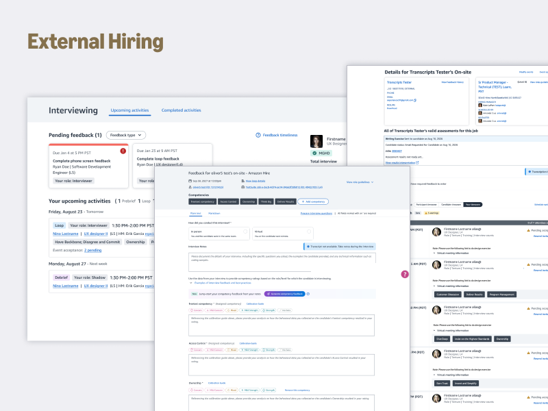
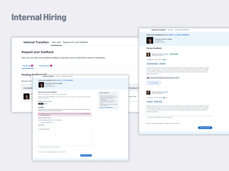
I don’t understand why you’d separate it into two pages and systems, when we could just have one. Interviewer, research session
Two design challenges, and the decisions behind them
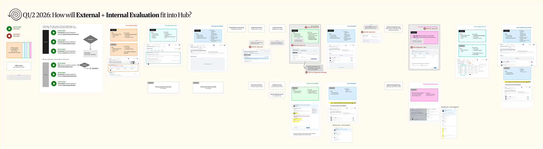
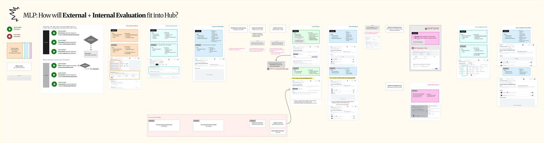
Challenge 1: coordination. Merging two live products meant working across three engineering teams and their design partners, each with their own patterns and constraints.
The decision: I mapped both workflows end to end, then broke the merge into sequenced steps: the activity view, then the interview detail page, then the feedback experience. That way the teams could ship it piece by piece instead of in one risky rewrite.
Challenge 2: internal and external evaluation genuinely differ, and those differences exist for good reasons, so forcing one identical flow would have broken something that worked.
The decision: consistency isn’t sameness. I went step by step, deciding what to unify for a consistent experience and what to keep distinct, so each side still worked the way it needed to.
Where it stands
Research validated the direction across all nine participants: people wanted both worlds in one place, and the argument that won them over was fairness and consistency. With that behind it, the work is built with engineering and now rolling out gradually to the full user base.
I set the success metrics before launch, and we’re measuring them as the rollout ramps:
- Fewer tools people switch between.
- Less time spent tracking work across systems.
- Consistent feedback quality across internal and external.
AI tools for evaluation
Owning the experience also meant shaping how AI fit into it. I mapped the whole evaluation journey, from accepting a loop to being recognized for good interviewing, into one story map, which became the shared picture the team designed against.
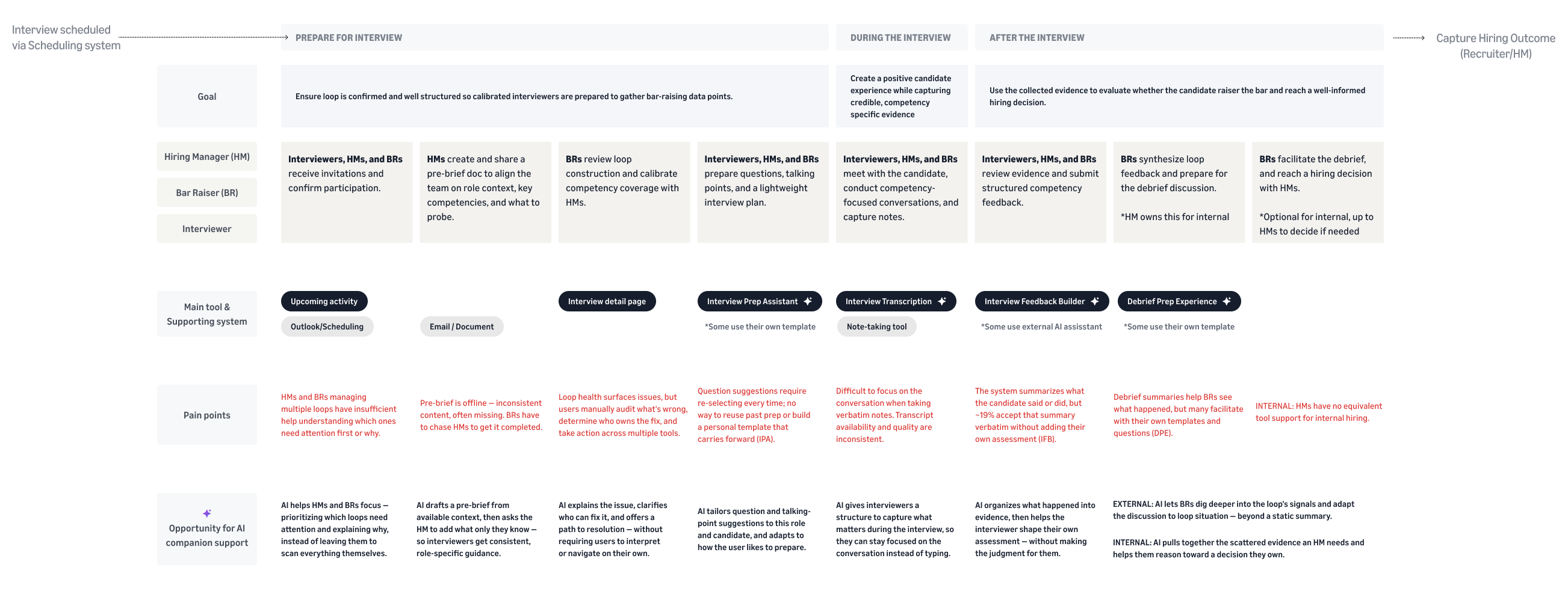
Each tool came down to the same question: where does AI genuinely help, and where does it need to get out of the way? Here they are, in the order an interview actually happens.
The tools I designed
My job was to find where AI helps.
Pre-brief companionhelps hiring managers write a strong pre-brief faster, so the whole loop decides better.
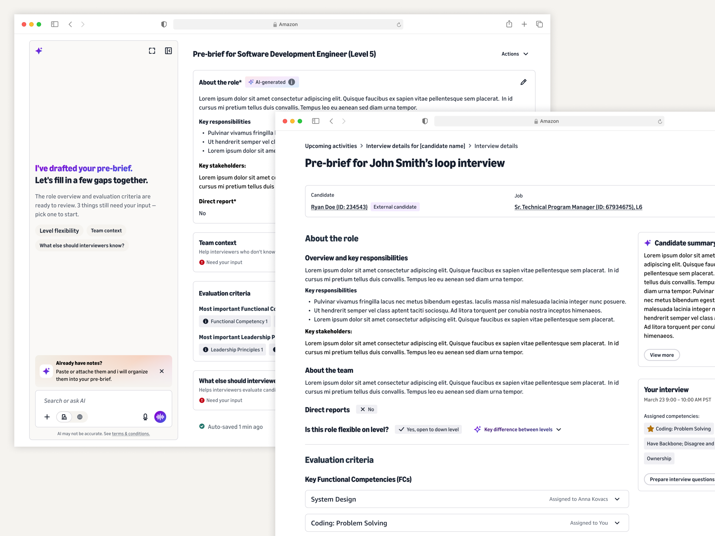
The pre-brief aligns the loop on what to assess before the interviews start. Without a good one, interviewers can assess the wrong things or lack the context to make a sound call. The companion drafts a starting point from what the system already knows.
Rather than generating the whole thing, it keeps the hiring manager in the driver’s seat: they refine the draft, fill in gaps, or reuse content they already have. Once it’s done, the whole loop has it automatically.
In development · Bar Raisers’ #1 pick for where AI could help, validated across two research rounds
Transcriptionlets interviewers engage with the candidate instead of typing notes.
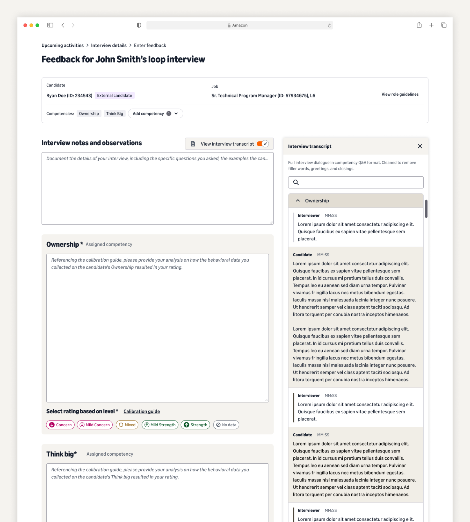
With the candidate’s consent, it captures the interview conversation and organizes what the candidate said by competency, ready for the interviewer to use, so they can stay in the conversation instead of splitting attention with their notes.
Consent comes first and interviewers stay in control: candidates opt in during the application and can opt out anytime, and interviewers always know whether a transcript has them covered or they should take their own notes.
“I became a better interviewer. It’s hard to concentrate on what somebody’s saying while you’re typing. This let me focus on the conversation and the questions I need to ask.”Interviewer
Interview Feedback Builderhelps interviewers write clear, well-organized feedback.
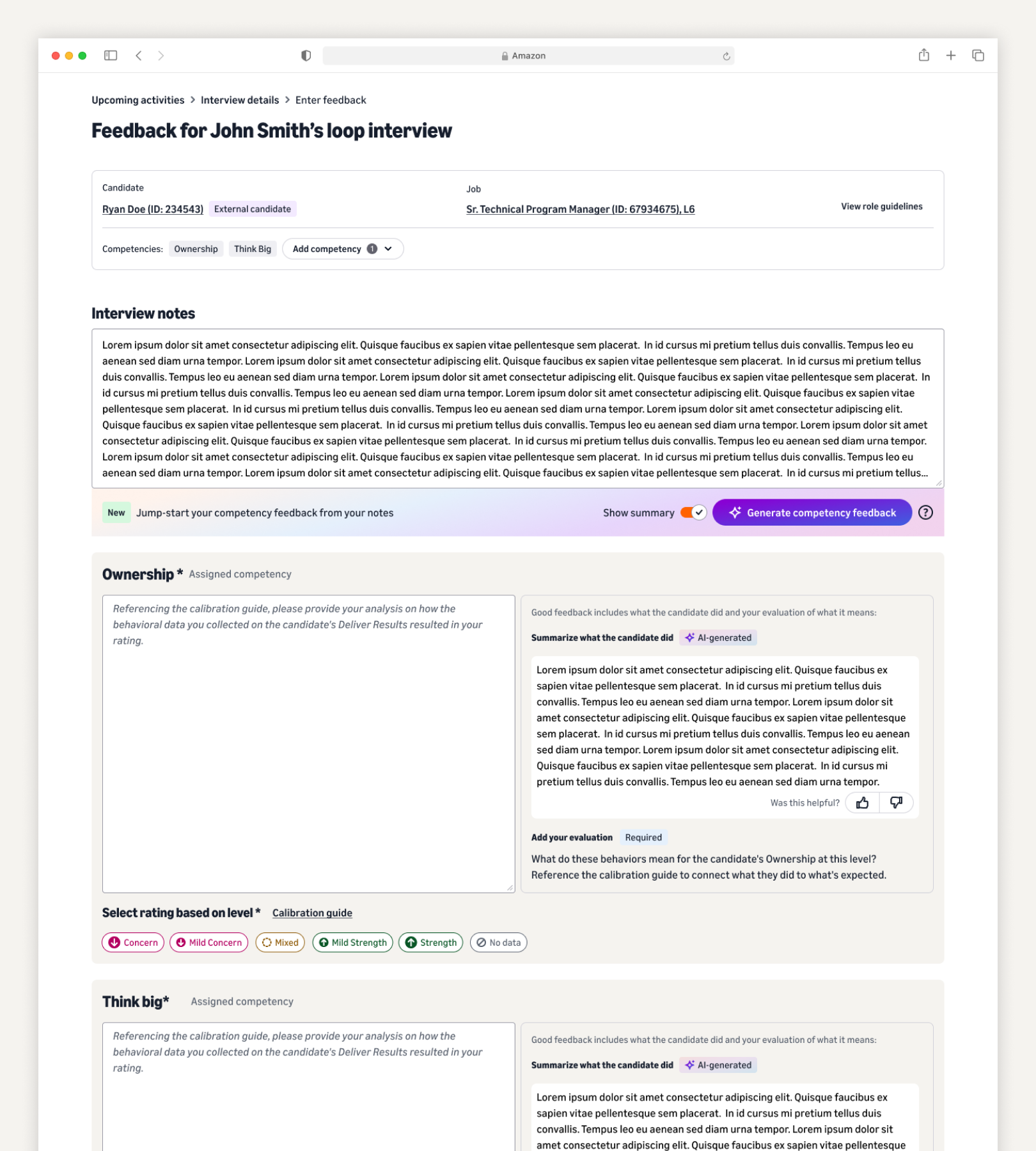
Amazon holds interview feedback to a high standard: specific, evidence-based, tied to competencies. That’s hard to do well under time pressure. It takes the interviewer’s notes and transcript and organizes them into a clear draft per competency, so they start from structure instead of a blank box.
It stops at organizing the evidence. It doesn’t decide whether something is a strength or a gap, or whether the candidate meets the bar. That judgment stays with the interviewer.
55% adoption (48K+ interviewers) · 78% edit the output as intended · higher-quality feedback loops are 1.5× more likely to hire a high performer
Debrief Prepgives Bar Raisers a synthesized view of the loop to prepare the debrief.
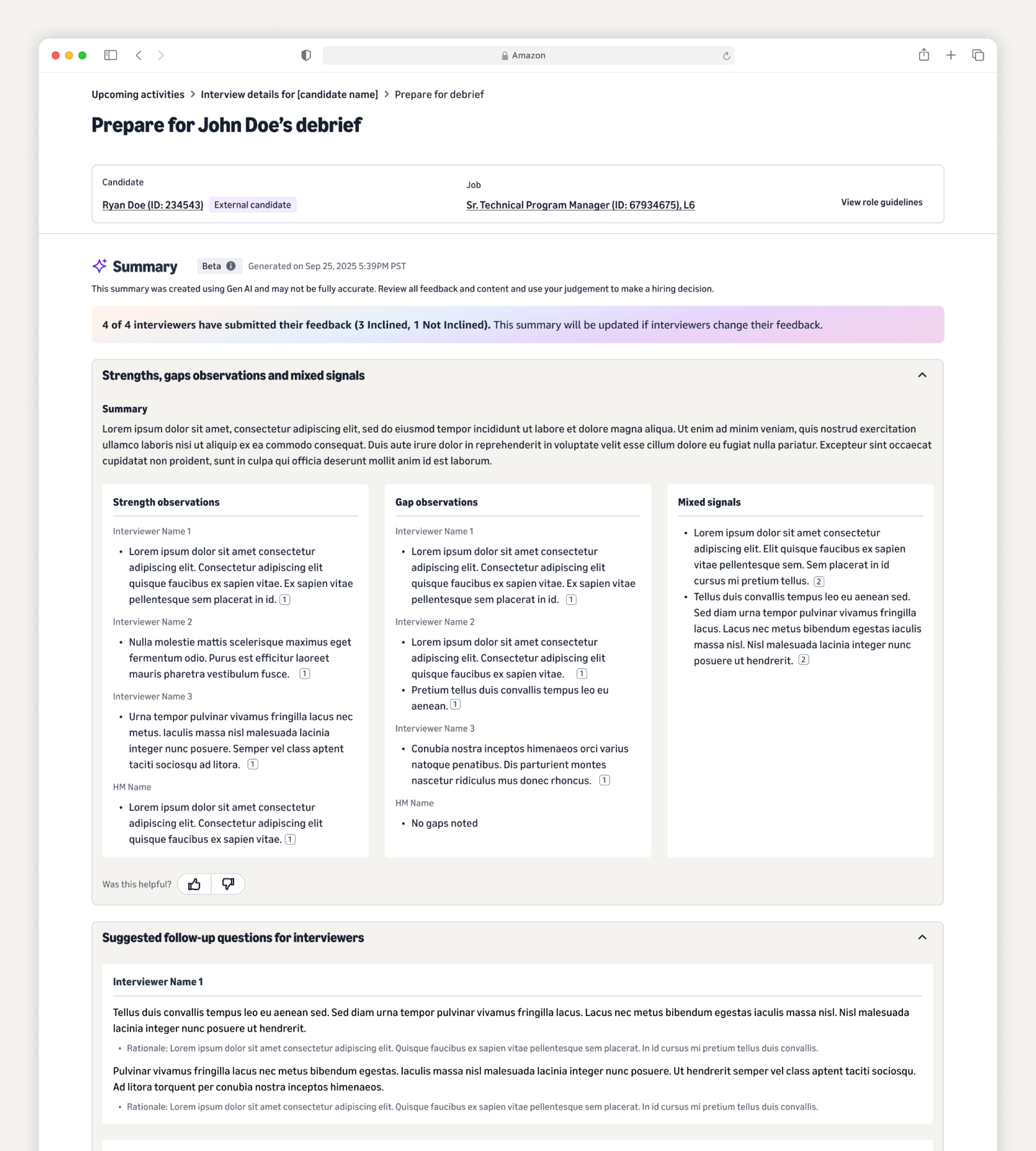
Before a debrief, the Bar Raiser has to make sense of the whole loop: reading every interviewer’s feedback, weighing it, and spotting where interviewers agree or conflict. It does that synthesis for them: strengths, gaps, and mixed signals, with questions to dig into.
It surfaces the signals but stops there. It doesn’t decide the outcome. And because Bar Raisers won’t rely on a summary they can’t check, every line links back to the exact feedback it came from, so they can verify anything in one click.
80% adoption · in a controlled study, 70% of users reported shorter prep time, vs. 56% among those who prepped the old way
The idea I recommended we not ship
Knowing when not to build something is part of the job.
Talent Quality Scorescores a candidate against historical hiring data to guide the decision.
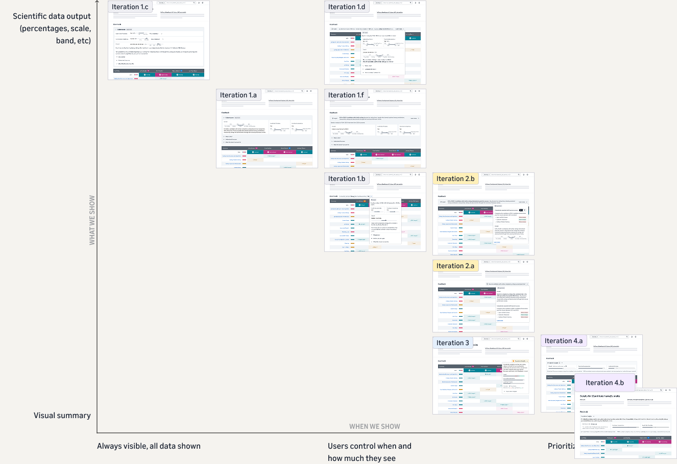
Instead of helping people prepare, this one offered a read on how likely a candidate was to succeed. The business case was appealing, but it collided with what Bar Raisers needed: a score shown before they formed their own view would anchor the very judgment we were counting on.
Working with a UX researcher, I tested variations across what we showed and when. The strongest one still sat on the wrong side of the line between informing a decision and steering it, so I made the case to leadership not to ship it, and they agreed.
27 research sessions · 22 participants · recommendation accepted by leadership
Design tenets for the evaluation space
Evaluation isn’t a space where “faster and easier” is always the goal. These are high-stakes, human decisions, so the right design sometimes adds friction on purpose, even when that’s harder.
- Support judgment, never replace it. In a high-stakes human decision, AI does the tedious work and people decide. Success isn’t automation. It’s people making better decisions, more confidently.
- Earn trust through transparency. People won’t act on what they can’t verify. If they re-check everything by hand, it’s failing; if they check a few things and trust the rest, it’s working.
- Less, but sharper. AI makes it easy to generate more, but doubling the content just doubles what people have to read. The goal is to cut through the noise, not add to it.
- Consistency isn’t sameness. Hold one standard where fairness demands it, but keep the real differences that each part of the process needs.
Looking back: the vision that started it
Back in 2022, before most of these tools existed, I storyboarded the experience I thought interviewers should have: accept a loop, prepare from a real template, stay present in the conversation, write better feedback, debrief on evidence, and get recognized for interviewing well. At the time it was aspirational.
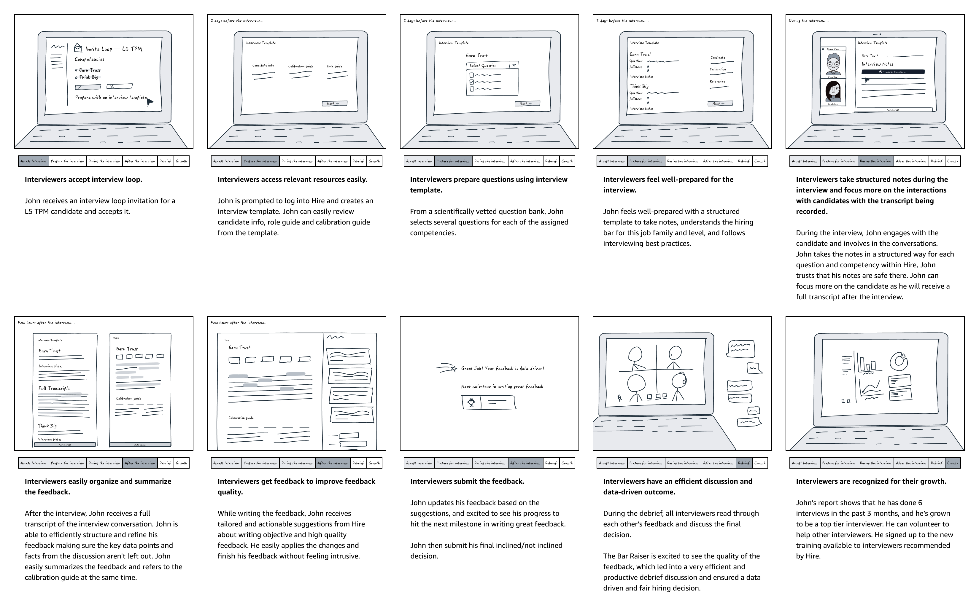
Looking at it now, most of those moments have become real products. That early picture is what the workspace, the consolidation, and the AI tools were all quietly building toward.
Two years ago, when we asked people about AI in hiring, they were hesitant, unsure, not ready to trust it. Today they use these tools every day and ask for more: more capability, more control. Designing through that shift, as it happened, is the part I’ve valued most. As an experience designer, I get to grow right alongside the people I design for.